2018 update:
It's once again David Sutherland Day so I've bumped this post (previously bumped last year). David would have been 69 today. Feel free to add a new comment below about his work.
Of note, there is now a Sutherland appreciation group on Facebook called:
The Scaly Sacrarium of Sutherland
And did you know that David Sutherland made his own customized lizard warriors that resemble his drawing from the Foreword of Holmes Basic? The one at the top of this blog? See this 2013 post on the Zenopus Archives for more on this:
DCSIII Customized Saurians
Original post from 2013:
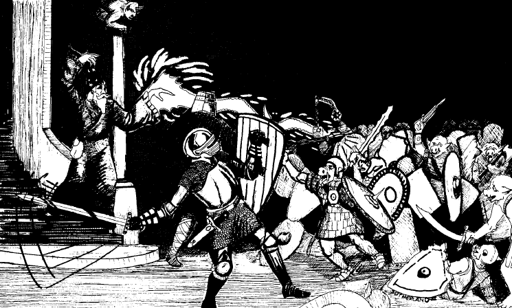
Today marks the birthday of my favorite TSR artist, the late David C. Sutherland III (aka DCSIII), who passed away too young (age 56) in 2005. I've designated April 4th as "David Sutherland Day". Dave's work defines the look of D&D in 1977, when his art graced the cover of the Holmes Basic Set and first AD&D hardback, The Monster Manual. His work also defined the look of Holmes Basic, being used for the both the cover, the title page (posted above) and foreword (the lizard rider that graces the title of my blog). He was also responsible for most of the artwork for the first Basic module, B1 In Search of the Unknown.
Tome of Treasures has a page with an extensive listing of his TSR credits.
In 2012 his Basic Set artwork was featured in a line of retro t-shirts from WOTC. And in 2013 his original painting was recovered from a crate at the WOTC offices.
Please post a comment on what your favorite work(s) of his.
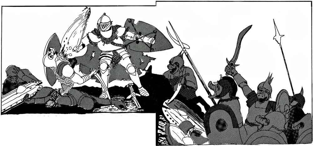
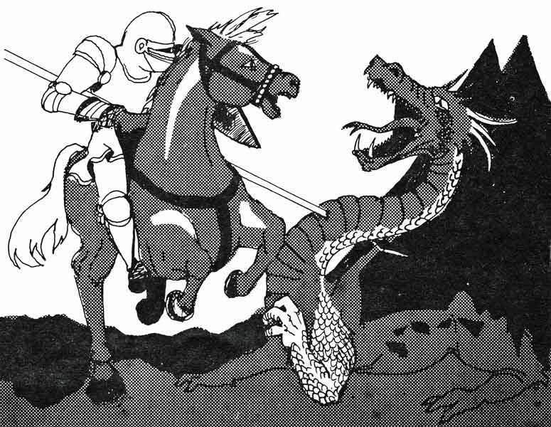
Here are a few somewhat obscure pieces from Swords & Spells (1976) that are very much in the same style as the Holmes title page piece:


I love most of his things--especially the works at the back of the DMs Guide, with characters crawling around in caves and such and all these little halflings, gnomes and dwarves being towered over by the elf lady who seems to be their leader. His layouts are great. I just wanted to comment though that the self-same WotC did not keep DCSIII on staff when they took over, and also through out nearly all of his works. Each time I write such comments on any blog, they get deleted. To me the men and women who worked making this game are more important than preserving some ideal that anyone who's acquired D&D is somehow...infallible. I don't support wizard$, because I support folk such as DCSIII and wish he'd been properly honored.
ReplyDeleteAnt, Giant, in the MM. I love that pic. :)
ReplyDeleteI have to wonder, the pic with knight gutting an orc, and the other with orcs charging towards something where there is piece os shield sticking out of left, what would the picture look if you combined the two competently?
ReplyDeleteThose pics are on two adjacent pages of S&S (a digest-sized publication), so they are intended to form a single scene.
DeleteOh too many to list for sure. DCS III is one of my favorites as well and definitely influences my own art. Sadly, I think he is much under appreciated.
ReplyDeleteHe is under-appreciated, Johnathan! My absolute fave is at the back of the Fiend Folio tome, where all the awesome drawings are. It's the wandering encounter table for faeries. I especially like the gorbel, which is getting thumped pretty good by a wee gnome, as a pixie swashbuckler stands by with a fancy rapier, ready to pop the miserable gorbel once the gnome has had his fill of uselessly thumping the thing. And the sylph is fab, sitting on a branch of her tree/house. They just don't make pictures like that anymore.
ReplyDeleteNo question: "A Paladin in Hell".
ReplyDeleteYeah, his illustrations ARE D&D for me.
ReplyDeleteI've always wondered if the fighter looking on as his wizard friend is overrun by giant ants in the MM also the paladin in Hell?
ReplyDeleteIf we're voting, the cover of the Holmes set is my favorite, hands down. Single handedly set up not just the fantasy setting but the whole rpg premise for me.
I swear that, that opening picture with the magic-user and fighter, being overrun by orcs at the top of this page is actually part of a larger drawing. Can ayone back me up on this?
ReplyDeleteThat's not something I recall, but I'd love to see it if it was!
Delete